Admin Manual - Understanding the Analytics Tab
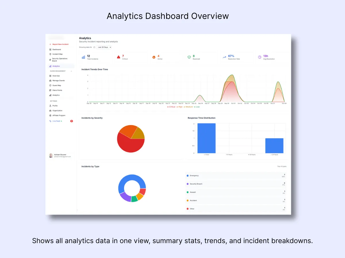
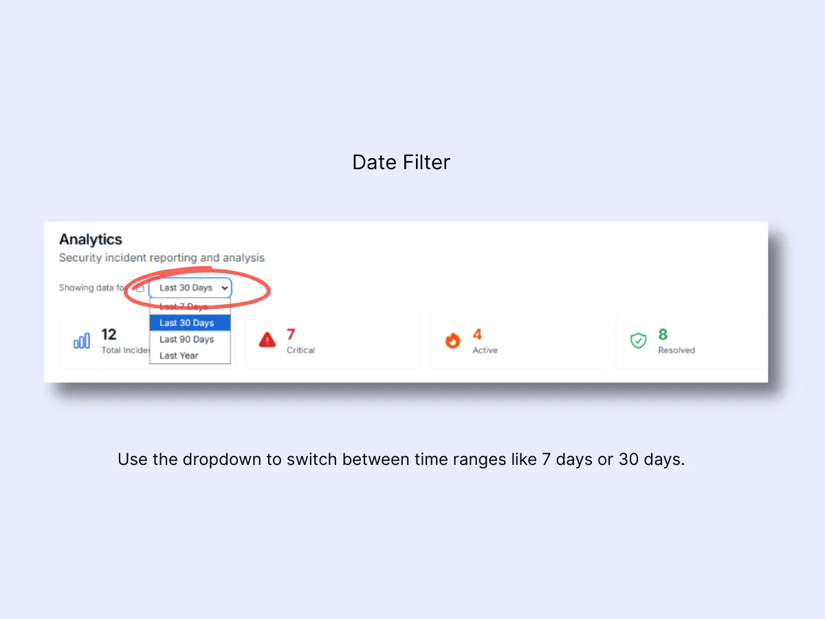
1. Date Range & Filters
What it Does: Select the time window you want to examine — 24 hours, 7 days, 30 days, or a custom date range. Every chart updates immediately when you adjust this filter.
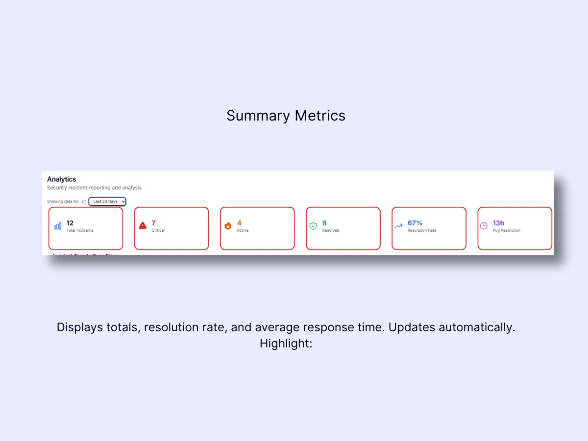
2. Summary Metrics – Quick Performance Snapshot
These cards deliver an at-a-glance overview of your organization's performance:
- Total Incidents: The total count of reports within the chosen time period.
- Average Response Time: The typical duration between an alert and guard response.
- Resolution Time: Mean time elapsed from incident start to closure.
- Critical Alerts: The number of high-priority cases logged.
- Patrol Compliance: Percentage of scheduled patrols that were completed.
- Client Satisfaction: The average feedback rating (when enabled).
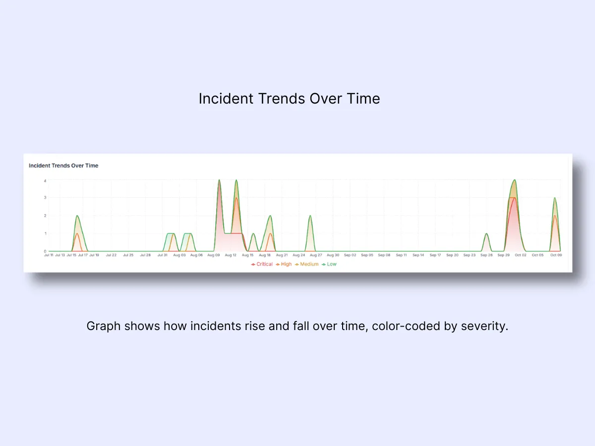
3. Incident Trends Over Time
Reveals when incidents most frequently occur and highlights severity-based spikes. Leverage this data to optimize shift scheduling, deploy additional guards during peak periods, and compare weekend versus weekday patterns.
Color Code: Critical
- High
- Medium
- Low
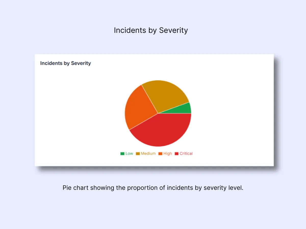
4. Incidents by Severity
A visual breakdown displaying the number of incidents under each severity level. This allows you to gauge whether operations are running smoothly or facing elevated pressure.
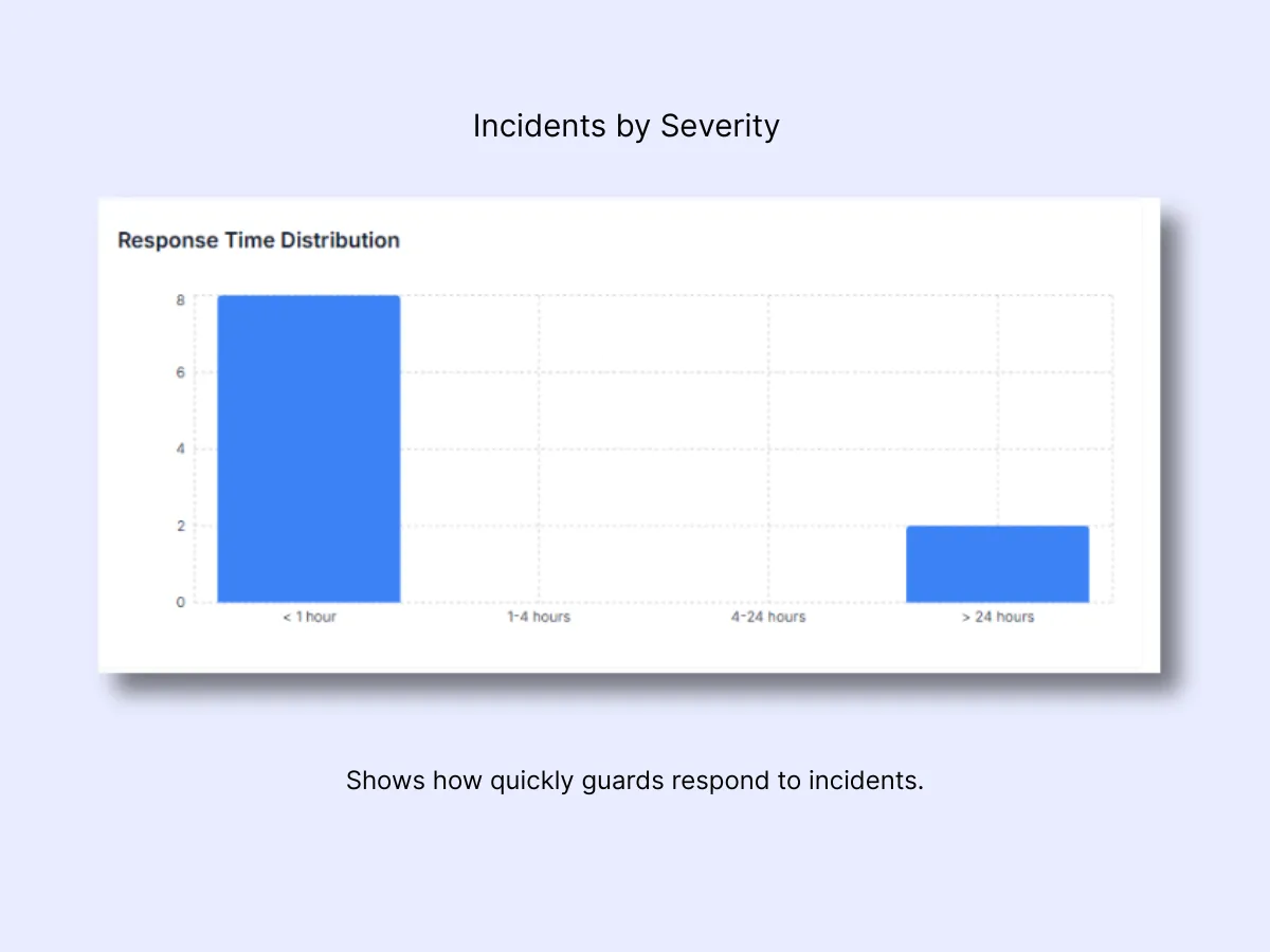
5. Response Time Distribution
Response Time Distribution
This chart illustrates how quickly your team responds once an incident or panic alert has been filed. Each bar indicates the number of incidents addressed within a particular time window.
- Under 5 minutes: Optimal. Demonstrates rapid, professional handling by on-site or nearby guards.
- 5–15 minutes: Reasonable for non-critical events or situations where distance plays a role.
- 15–30 minutes: Sluggish. Investigate whether guards were mid-patrol, off-site, or hindered by communication issues.
- Over 30 minutes: Unacceptable for active incidents. Examine coverage gaps, dispatch efficiency, or signal reliability.
A prominent bar in under 5 minutes signals that your response protocols are effective. When delays begin accumulating at 15+ minutes, look into who was on shift and identify what caused the hold-up.
Related Solutions
- Control Room Dashboard — real-time overview that feeds into these analytics
- Patrol Management — QR-verified patrols that drive patrol compliance metrics
- Shift and Duty Management — track who was on duty during response time windows