For South African control rooms, MyProtektor brings guards, incidents, panic alerts, patrol status, access control activity, and client-ready reports into one operational dashboard.
Three incidents. Two panics. One operator switching between four apps
Friday night at 11 PM. A panic alert comes in from a residential site. While your operator pulls up the guard roster in a spreadsheet, a second incident report arrives from a warehouse. The phone rings, a client asking about a suspicious vehicle reported 20 minutes ago that nobody followed up on. This is what running a security control room looks like when your tools don't talk to each other.
Your operator has the incident in one app, the guard schedule in a spreadsheet, the client details in a CRM, and the site map in Google Maps. By the time they piece together who is available and where, the situation has already escalated.
Every additional tool switch costs time. Every missing piece of context creates risk.
How MyProtektor handles it
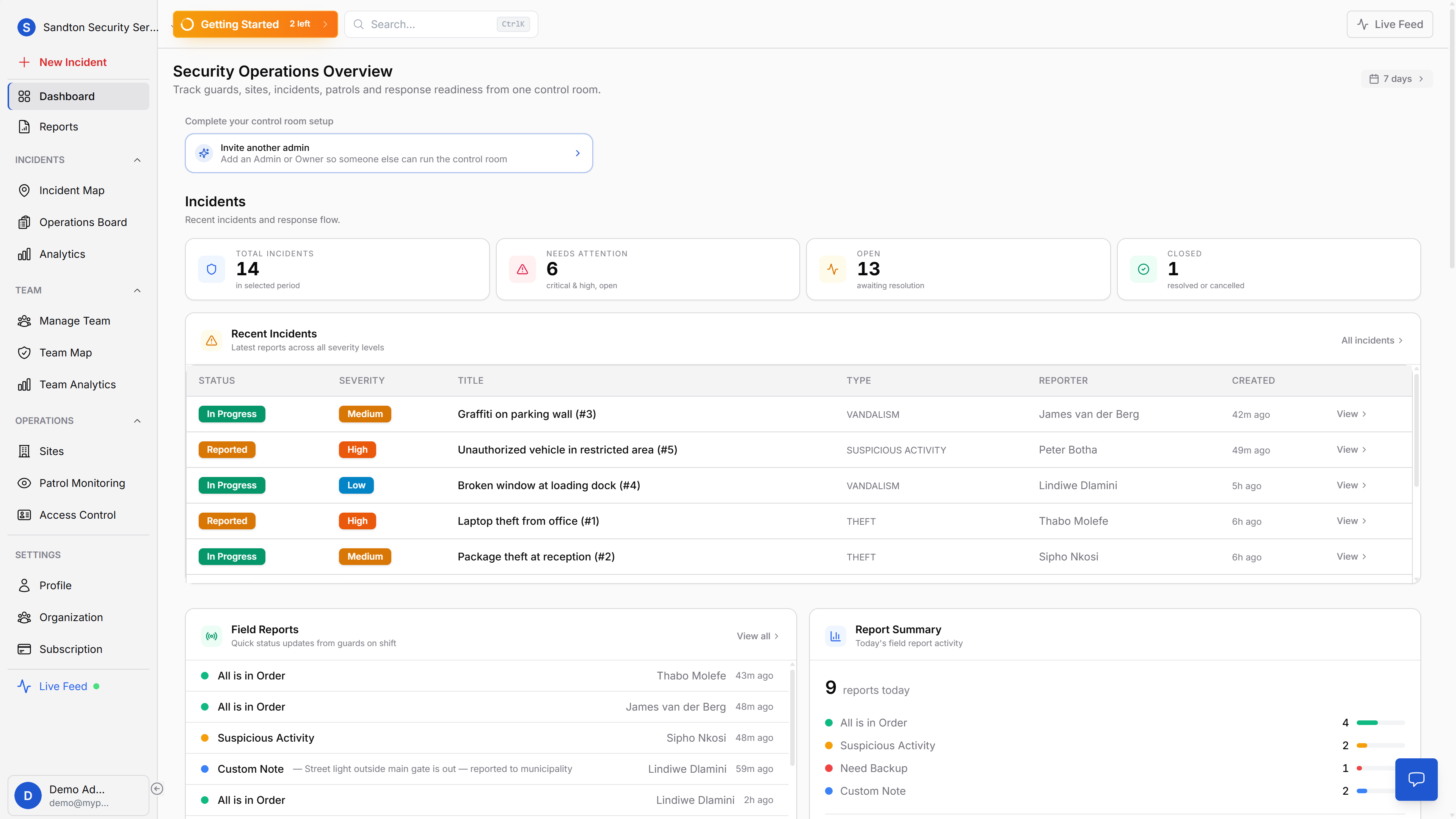
One dashboard, full visibility
MyProtektor's web dashboard consolidates your operational data into a single screen. At the top, four KPI tiles show your current picture: Total Incidents, Needs Attention (critical and high severity, still open), Open (awaiting resolution), and Closed. A time range dropdown lets you filter from 24 hours to 365 days.
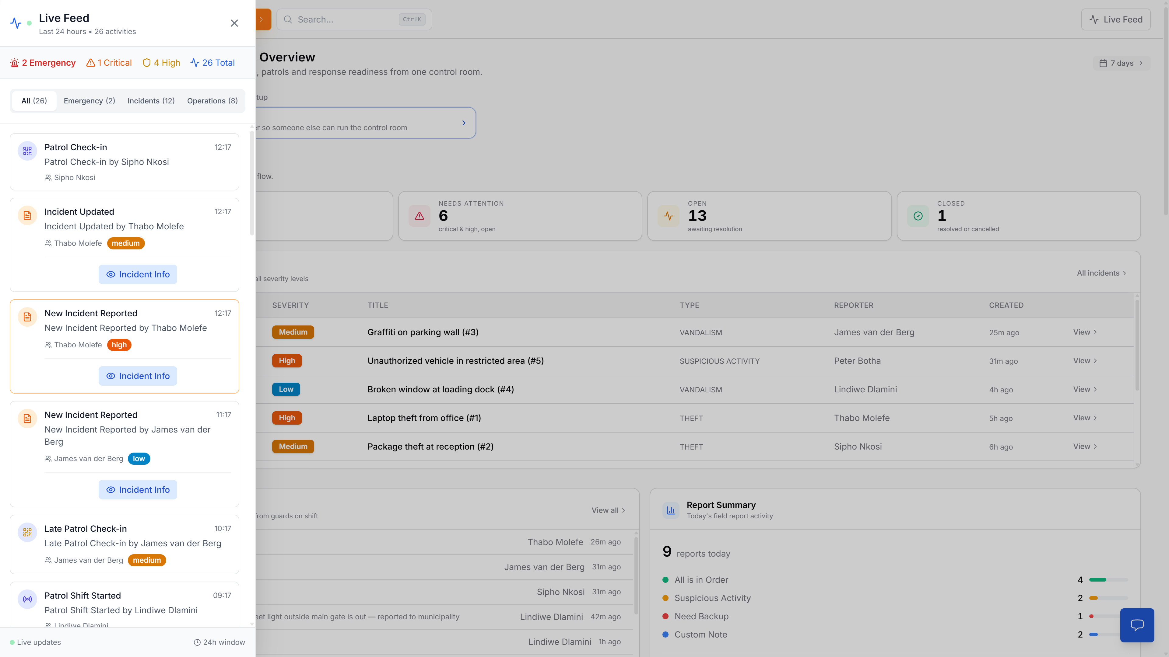
Below the KPIs, the 10 most recent incidents appear in a table with severity, status, assigned guard, and time since creation. Open incidents are prioritised at the top. A live feed sidebar streams events as they happen, incidents, status changes, field reports from guards, so the operator on duty always has the latest picture.
 Click to expand
The control room is more than one dashboard tab
The main dashboard is the operational summary, but real control-room work moves between live map, workflow board, and reporting views without losing context.
 Click to expand
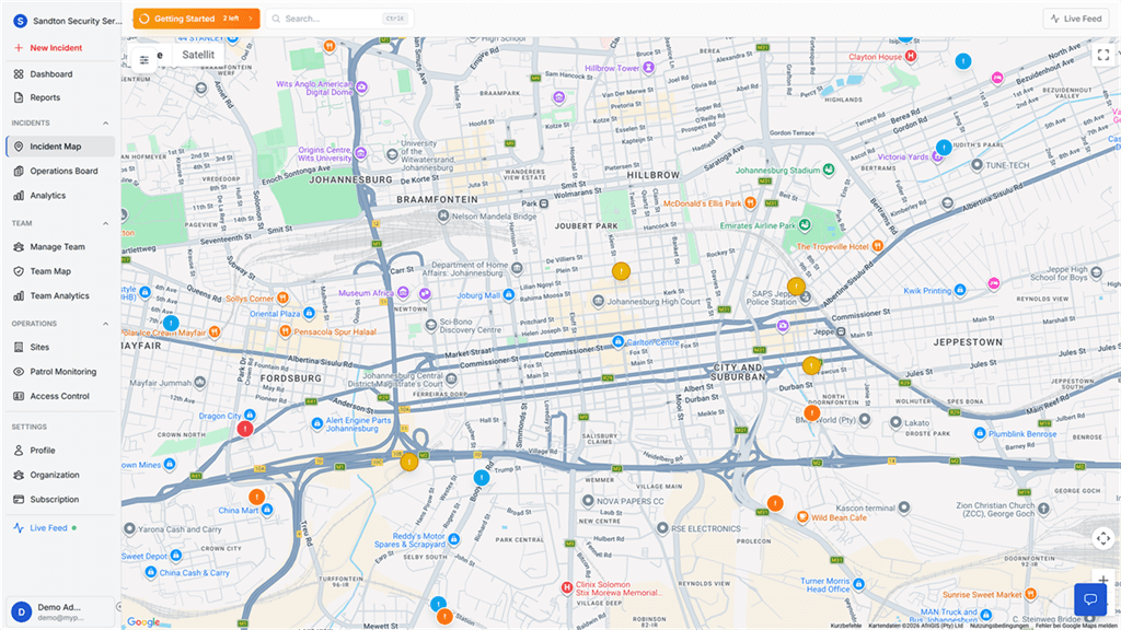
The incident map gives your operator geographic awareness immediately: where incidents are happening, which sites are affected, and what needs attention first.
 Click to expand
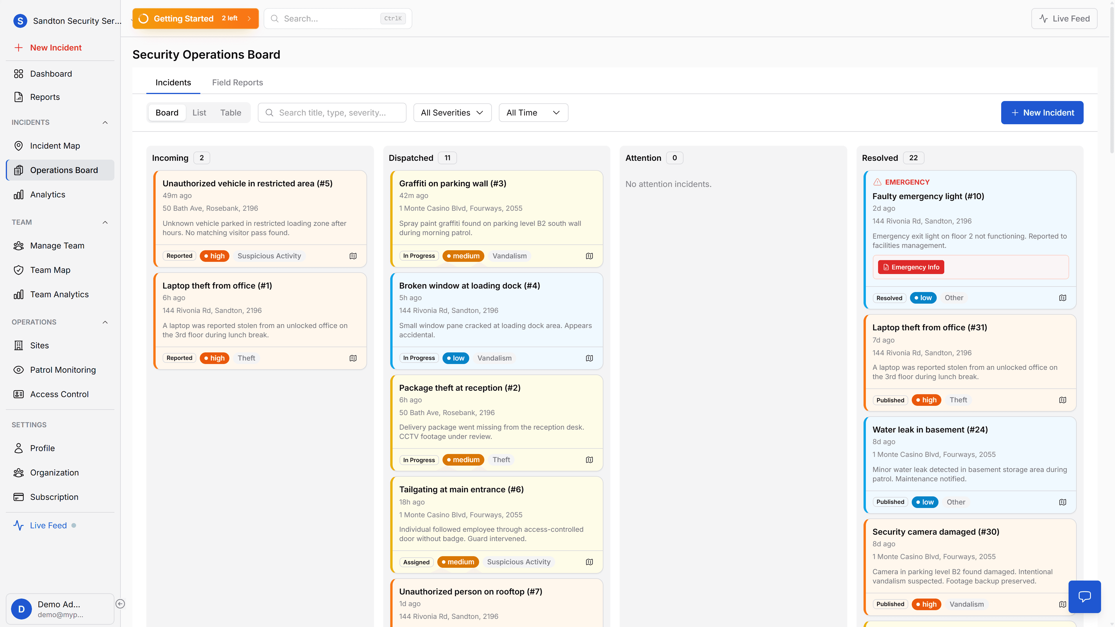
The Operations Board is where incidents move through the workflow. Incoming, dispatched, attention, and resolved states make handovers and accountability explicit.
 Click to expand
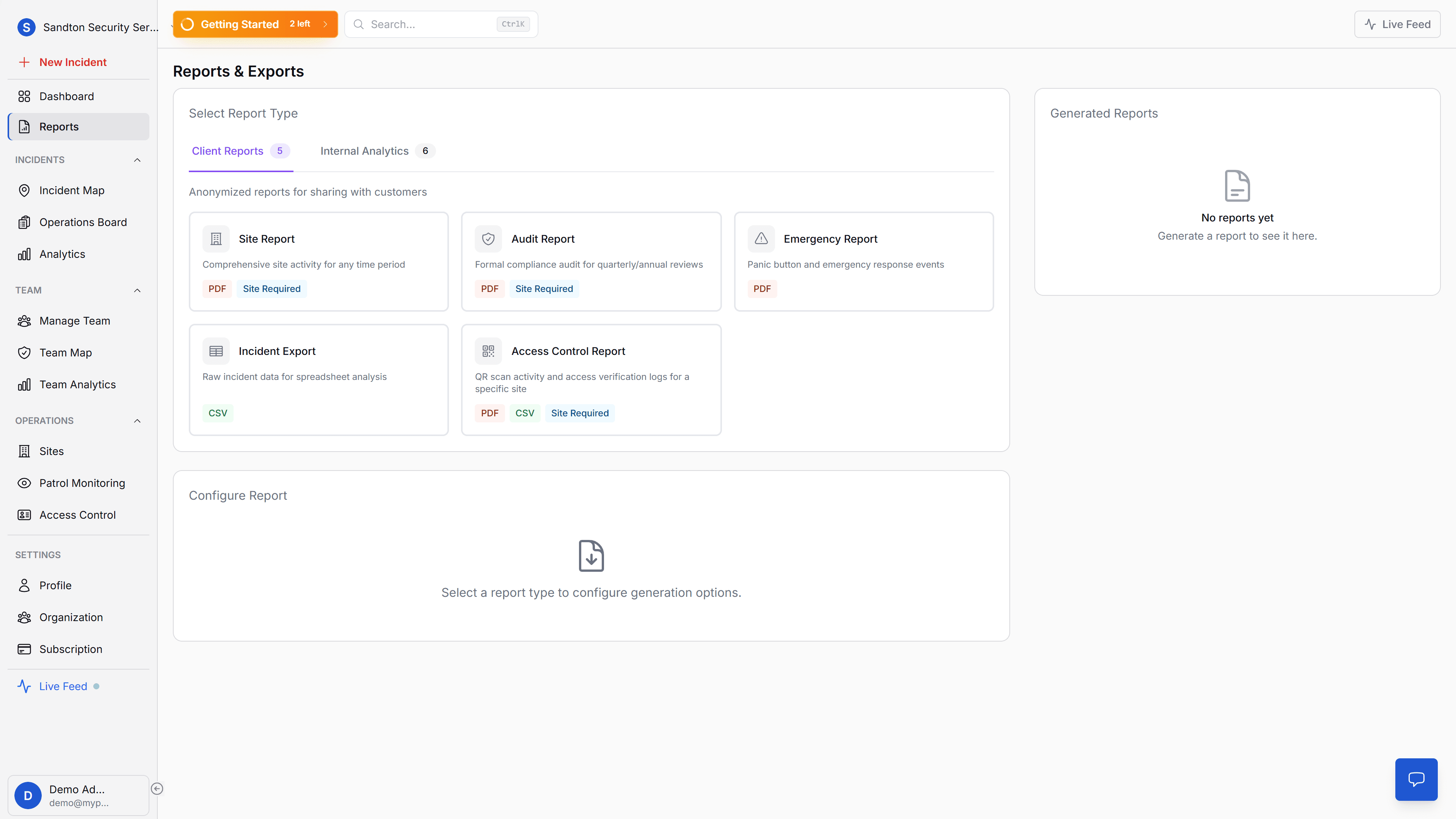
And when a client, manager, or auditor asks for proof, reporting is part of the same environment. You do not move data into a second tool just to explain what happened.
Incident lifecycle management
The operations board manages incidents through four stages: Incoming alerts that need attention, Dispatched incidents with guards assigned, Attention for situations requiring escalation, and Resolved cases. Three views, board, list, and table, let your operators work in the format that suits them. Every status change is timestamped with the responsible person.
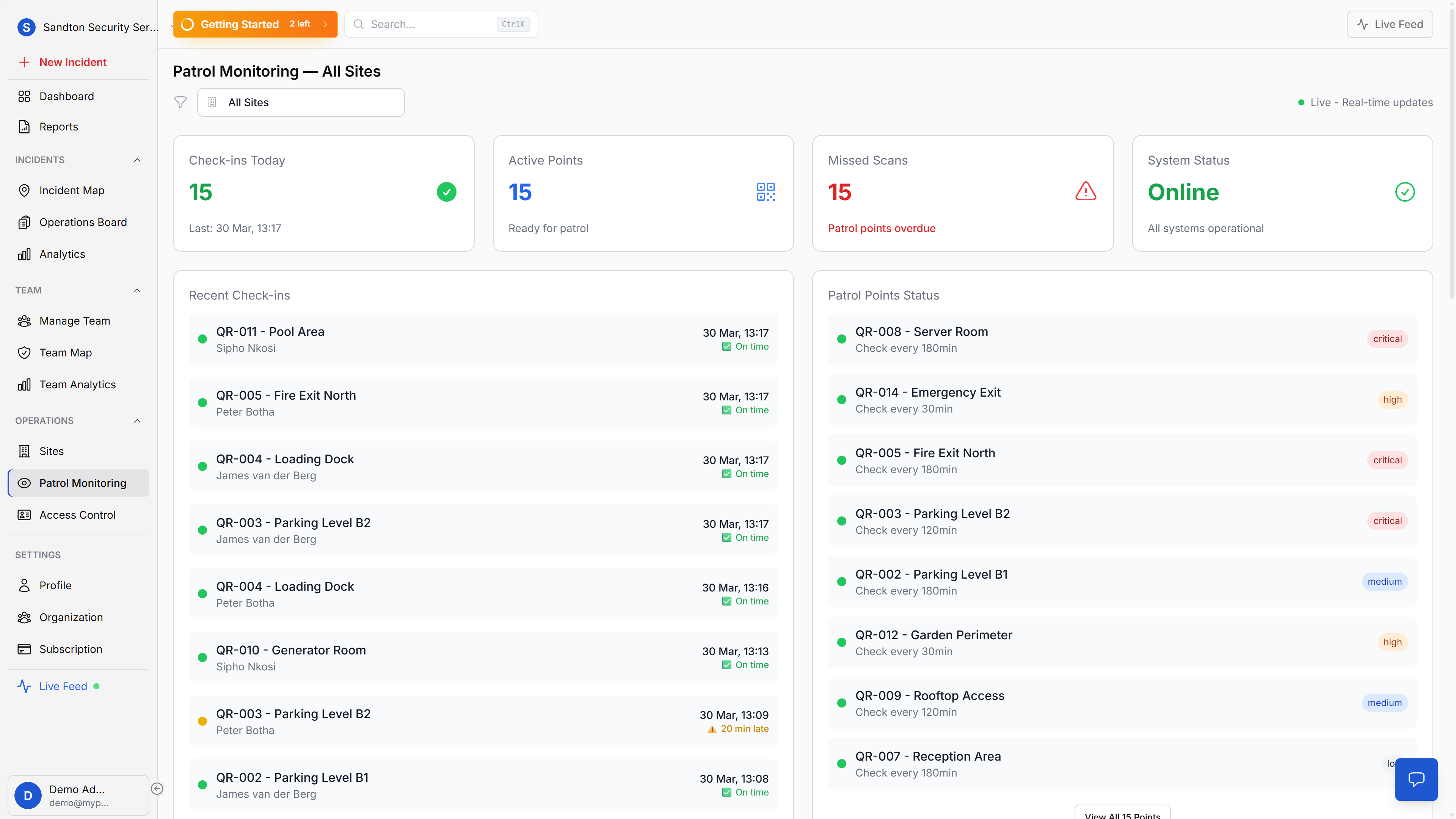
Guards in the field send real-time updates through field reports: All is in Order, Suspicious Activity, Need Backup, or a Custom Note. These appear on the dashboard and in the operations board, giving your control room live intelligence from the ground.
Everything else on the same screen
Guard tracking, site monitoring, patrol checkpoints, and access control activity all appear as dashboard widgets, no app switching. The guard tracking map shows who is where. The QR Checkpoint Watchlist flags overdue patrols. The access control widget shows the last five gate decisions. Site widgets display patrol point counts per location.
Analytics for the bigger picture
On the Standard plan and above, the analytics tab gives you trend data: incident trends over time, severity distribution, type breakdown, response time distribution, and guard performance rankings. This is where you move from reactive to informed, identifying patterns, comparing guard performance, and spotting operational gaps before they become incidents.
Reports and exports (Professional plan) let you generate PDF and CSV documents for clients, insurers, and internal review. Site Reports, Audit Reports, Emergency Reports, and Guard Performance reports are all available through the reports page.
Why this matters for your business
Faster decisions under pressure. When everything is on one screen, the operator doesn't waste time switching between apps. The panic alert, the available guards, and the map are all visible at once.
Multiple operators, same live data. All data syncs in real time. Two operators can work the same shift, see the same incidents, and update statuses simultaneously without conflicts.
Data-driven improvement. Analytics show you which incident types spike on weekends, which guards respond fastest, and where your operation has gaps. That's how you improve, with numbers, not guesswork.
The professional control room that wins contracts. When a prospect visits your operation and sees a live dashboard with real data instead of a whiteboard and radio, that's a different conversation. When an insurer asks for incident response metrics, you export the report. When a client audits your record-keeping, the data is timestamped and traceable. This is the kind of operational visibility that retains contracts and wins new ones.
What if internet drops? The mobile app continues working offline for guards in the field. Incident reports, patrol scans, and panic alerts queue locally and sync when connectivity returns. The dashboard needs an internet connection, but the guards' work is never lost.
Do we need special equipment? No. Any web browser on any screen. Desktop monitors work best for control room environments, but a laptop on the ops manager's desk works too. No plugins, no installation, no IT department required.
Getting started
Open a web browser and log in. The dashboard works on any screen. No installation, no plugins, no configuration. Your data appears the moment your team starts using the mobile app.
For detailed documentation, see the Dashboard guide, Analytics guide, and Operations Board guide.